Chapter 18
Simpson’s Paradox
In this chapter of the book, I present an example of Simpson's Paradox involving the batting averages of Derek Jeter and David Justice. In terms of understanding this intuitively, I wrote: "Unfortunately, every time I try to work it out, my head hurts. Some of my readers have provided a nice explanation, which I have posted at FlawOfAverages.com."
Aaron Brown has been fascinated with numbers, statistics, and betting as long as he can remember. He parlayed this interest into writing some books, The Poker Face of Wall Street and A World of Chance, playing a lot of high-stakes poker and working as a financial trader, portfolio manager, risk manager and finance professor. His explanation of the Jeter-Justice paradox is presented below.
The Jeter-Justice Paradox
by Aaron Brown
David Justice of the Atlanta Braves had a higher batting average than Derek Jeter of the New York Yankees every year from 1995 to 1997, yet Jeter had the higher batting average over the three years. How is this possible?
| 1995 | 1996 | 1997 | Total | ||
|---|---|---|---|---|---|
| Jeter | Hits | 12 | 183 | 190 | 385 |
| At Bats | 48 | 582 | 654 | 1284 | |
| Average | 0.250 | 0.314 | 0.291 | 0.300 | |
| Justice | Hits | 104 | 45 | 163 | 312 |
| At Bats | 411 | 140 | 495 | 1046 | |
| Average | 0.253 | 0.321 | 0.329 | 0.298 | |
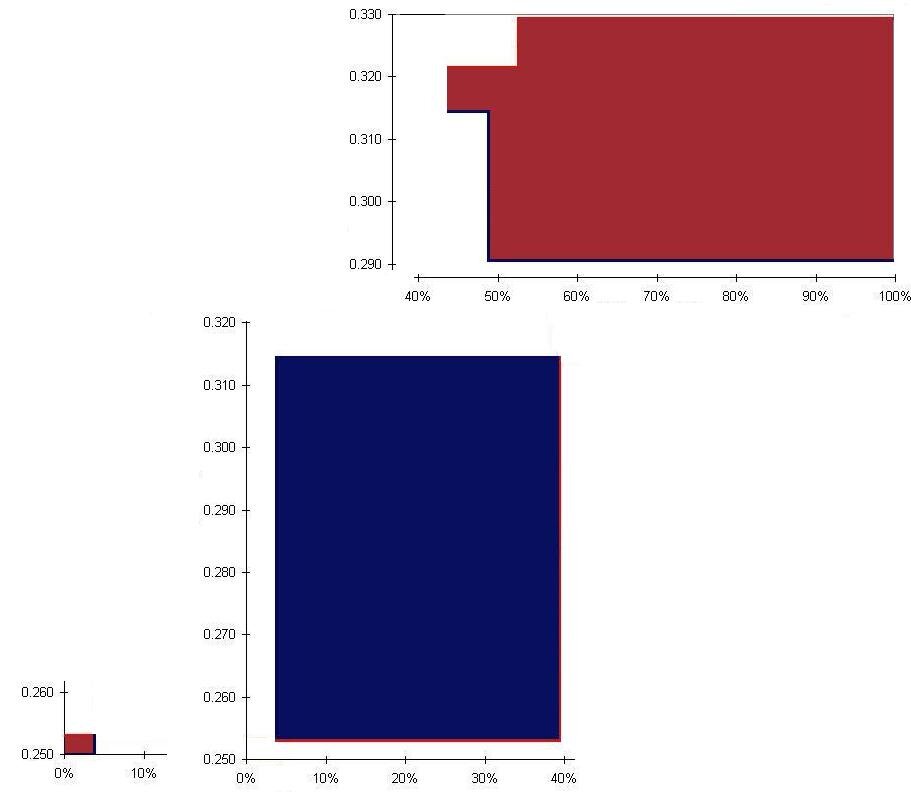
In this case, a picture is worth 1,000 numbers. The chart below shows each player’s batting average for each season, plotted against the percentage of at-bats in the season. Jeter is in blue, Justice in red. For example, Jeter’s 48 at-bats in 1995 were 4% of his 1,284 total, so his 0.250 batting average for that season extends from 0% to 4%. Justice’s 411 at-bats the same year were 39% of his 1,046 total.

Each of Justice’s three steps are higher than the corresponding step for Jeter, showing that Justice had the higher average each season. But Justice’s first low step is much longer than Jeter’s first low step. Looking at the picture, it’s hard to guess whether the red line or the blue line had a higher average value over the period. But you can certainly see that having each step higher is no guarantee of a higher average value, the lengths of the steps (that is, the number of at-bats at each average) matters as well.
Here is the same chart, with the areas of Justice’s advantage colored red, and the areas of Jeter’s advantage colored blue. The player with the most area had the highest batting average over the three years.

We can do a quick computation to get the answer. The little red box on the left has a height of 0.003, since Justice hit 0.003 higher than Jeter (0.253 versus 0.250), and a length of 4%, since it represents 4% of each player’s at-bats. The area is 3 × 4 = 12. The big blue box in the middle has height 0.061 (0.314 versus 0.253) and width 35%. 61× 35 = 2,135. The big red shape on the right is not quite a rectangle, but we won’t be far off its area if we pretend it is 0.038 high and 52% wide (break off that little piece sticking out to the left and use it to fill in the upper left corner). 38× 52 = 1,976. So we have 11 + 1,976 = 1,987 for Justice and 2,135 for Jeter; Jeter’s area is bigger, so he had the higher average over the period.